CASE STUDY
Civic Pulse
An app for users to search national and local bills.
I, Felisha Alexander, was the UX Designer and Researcher for creating Civic Pulse
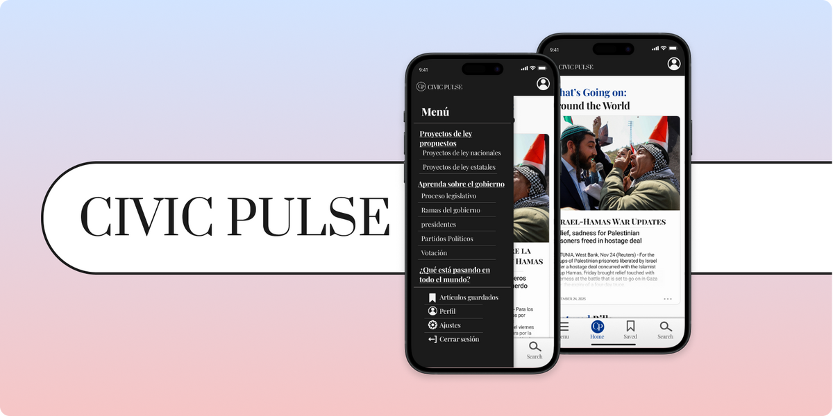
Homepage of Civic Pulse in English and the Menu in Spanish
Designing a way for users to learn about the bills in their Nation and State
The problem? Users had no easy way to access proposed and recently passed bills in their state and Nation. Other websites had the information but was hard to navigate and understand. I needed to make an app that not only makes the journey easy but also gives the users language options. Not only will english speaking and reading users will be using this app, but users that are new to the States, or users' who's parents are immigrants and may not know the language well.
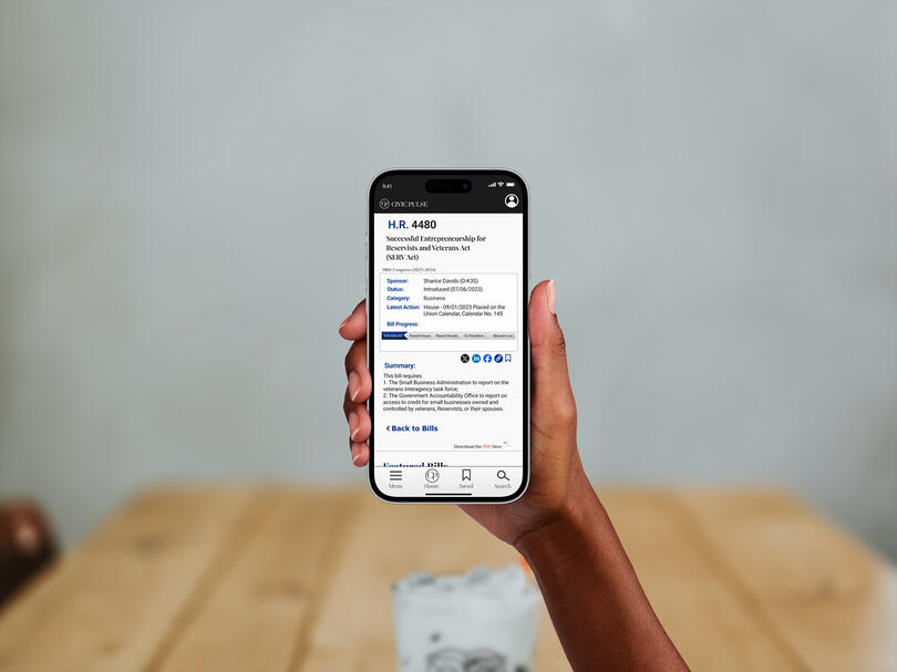
Civic Pulse bill description screen
Getting Started
To start I began a competitive analysis to get a better understanding of how other apps and websites are putting their information together. What are they doing right? What do they need to work on? What should I implement in my designs for the user?
By conducting this analysis I not only got to see what competitors are creating for the users, I also got to have a better understanding of how the United States government works. It was a wonderful learning experience and sparked new ideas for me to add to Civic Pulse.
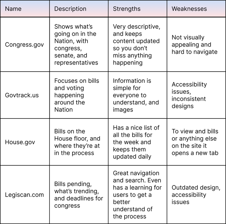
My competitive analysis of the competition, finding what to implement and what to leave out in the design
Drafting the Designs
Putting the wireframe together I decide where elements should be placed, and what scanning pattern I want to use for this project.
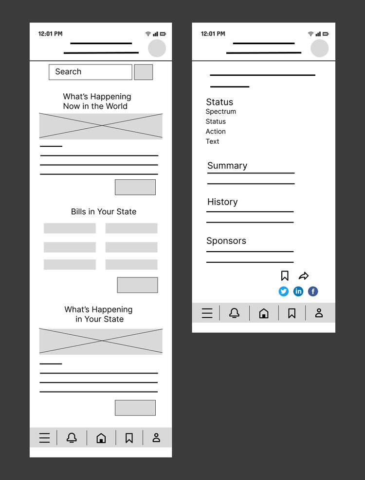
Low-fi wireframe of the Homepage and Bill Screen to get a general idea of the layout of the design
From Lo to Hi
I took the lo-fi wireframes and created a very simple lo-fi prototype for users to test. I wanted to see what users thought of the start of the design and what needed to be changed before creating the hi-fi mockups.
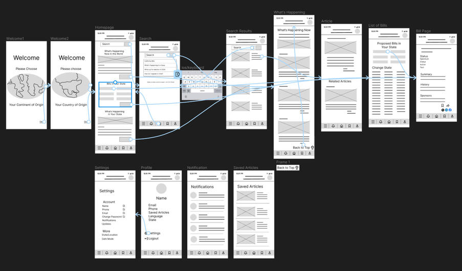
The very simple interactions for users to complete easy tasks and give feedback on the basic layout